


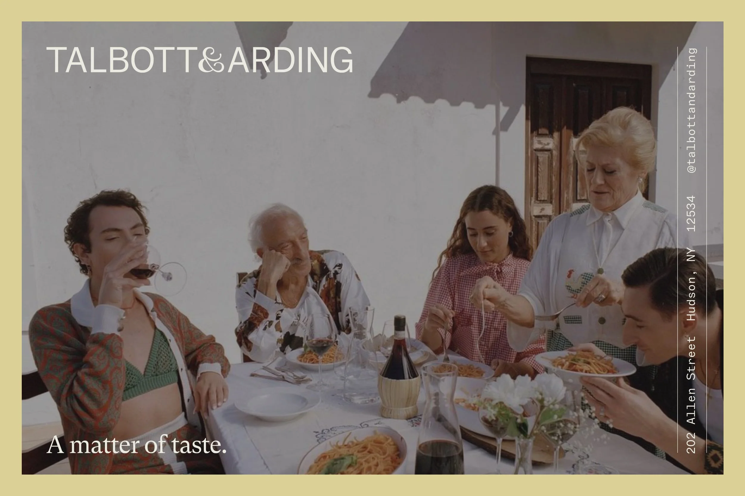


The brand identity for Talbott & Arding is inspired by the Hudson Valley and a 'taste first' approach. For Talbott & Arding, this area is where food, ideas and creativity thrive, and it is here where the brand has established a community of farmers and makers who share its commitment to things that taste like the places they’re from.
Brand strategy and identity team: Rebecca van de Sande, Jessi Brattengeier and Vivian Dehning
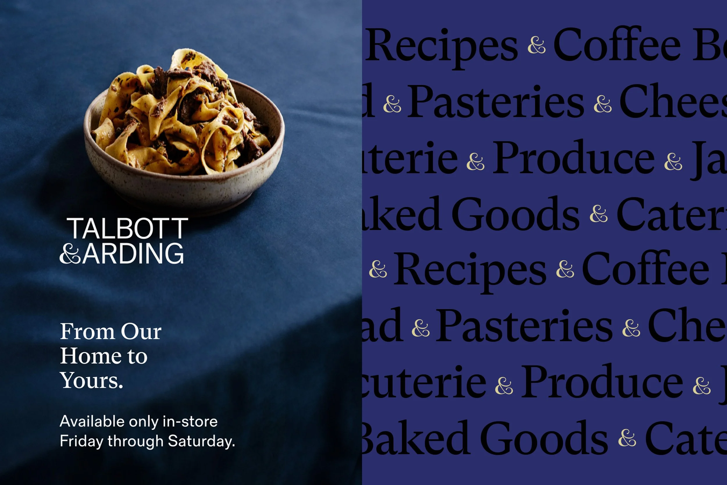
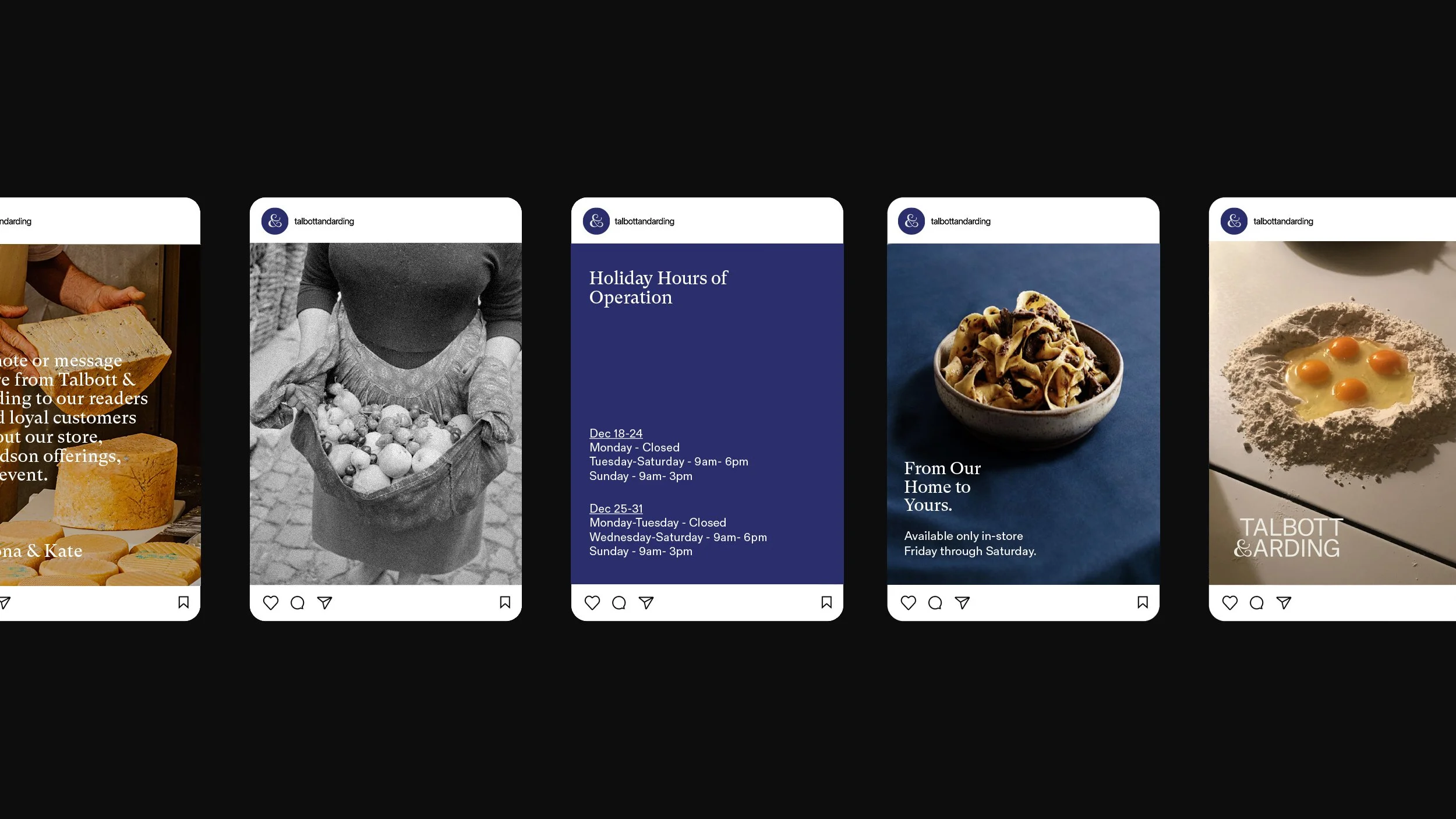
branding strategy, visual identity program, environmental graphics, packaging, web, photography.
“A poet's hope: to be, like some valley cheese, local, but prized elsewhere.”
- W.H. Auden, British-American poet
“I felt once more how simple and frugal a thing is happiness: a glass of wine, a roast chestnut, a wretched little brazier, the sound of the sea. Nothing else.”
- Nikos Kazantzakis, Greek novelist